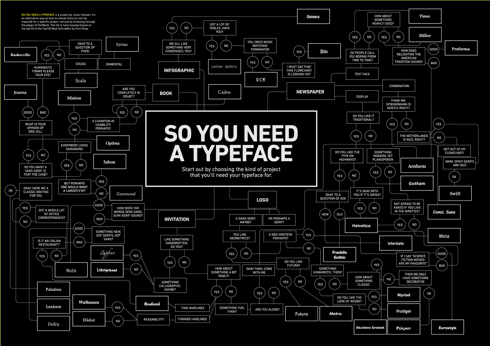
2 responses
Very nice! It makes me want to work with type again.

Of course, I'd prefer it were black on white for readability... yay for Invert!

Black on white isn't always the most readable though. In large chunks of course, it certainly is. :) But for short phrases or text meant to be consumed in discrete bits, it becomes less certain that black on white is the most readable.

For instance, many large road signs here are white on dark green... and there's definitely no problems with readability there. Like so much else in design (and life!) context is key.

Just some food for thought. Food like nuggets. Omnomnom.